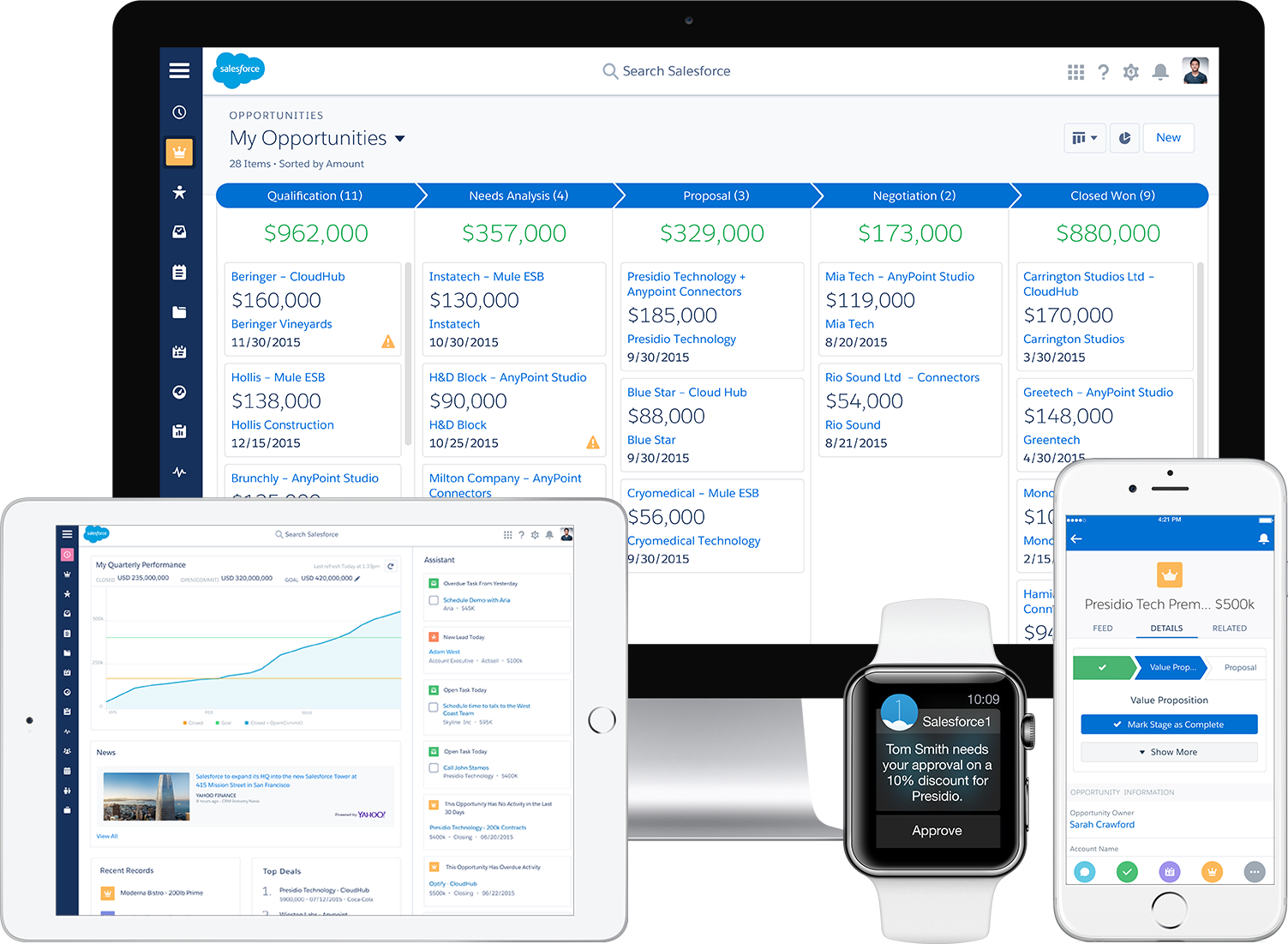
This week, Salesforce announced a completely new look and feel for the cloud CRM platform, which the company is calling “Lightning Experience.” In keeping with Salesforce Integration, an easy way to connect external data sources with Salesforce, the new Salesforce Lightning Experience updates the Salesforce user interface and makes it even easier for users to customize how Salesforce looks for them. This might mean adding beautiful new charts and graphs, remixing all the data sources you need to run your business, building apps that better integrate with the look of the platform, or any other way to make Salesforce more useful.
So What Is Lightning Experience Exactly?
Lightning Experience is the broad term for the entire new Salesforce user experience, made possible by various complementary “Lightning” branded elements, including Lightning Connect and the new Lightning Design System. By seamlessly combining various applications and data sources using consistent design guidelines, Salesforce helps users enjoy a more streamlined experience and achieve new results with the platform.
Some of the more concrete user-facing elements of the update include a home screen that highlights goals and account insights, and features an assistant that automatically surfaces leads and tasks and opportunities. Rather than having to navigate to individual pages and reports, Lightning surfaces the information you need in a context where it makes sense, increasing the utility of all the information Salesforce stores. (Jitterbit, of course, is a key part of bringing information from multiple sources into Salesforce for viewing in nice charts and graphs.)
Who Else Is Advancing Design?
With Lightning Design, Salesforce is joining a few big names that have made some major design statements in the last few years. Just as Google’s Material Design and Apple’s flat design and use of transparency in iOS have redefined the ways developers build apps and users interact with them, Lightning aims to redesign how we interact with information at work.
Salesforce listed clarity, efficiency, consistency, and beauty as its top priorities with the Lightning Design System. Note that beauty comes last, reflecting that design impacts how we use apps just as much as what they look like. The new design will make it easier to use Salesforce both in general and on different devices, and will streamline and standardize the user experience of any app developed for Salesforce. It’s a smart way to make sure Salesforce is ready for all of the new devices that will come out as the IoT continues to grow.
What Does It Really Mean?
It’s easy to think that the new Lightning user experience is just about things looking pretty. But as we saw with the design priorities and other Lightning elements, the Lightning Experience is part of a larger trend toward separating how apps look from what they do, and what information they are able to access (thanks to solutions like Jitterbit). This separation will continue to become more important as apps are used on more devices and access new types of data, so we think that Salesforce is making a smart decision in getting ready for this shift right now.
Jitterbit is already in tune with the Lightning Experience and will be showcasing some cool new use cases at Dreamforce that were built on the Lightning model. Come by our Dreamforce booth in September for a chance to be one of the first to get the true Lightning Experience.